Your next planning task is to consider the fonts you will be using when producing both your magazine cover, contents pages and website.
"Why are font choices important?"
Font choices play a crucial role in the design of a magazine’s front cover and contents pages because they directly influence how the magazine is perceived and how effectively it communicates with its audience. Here's why font selection matters:
1. Font Choices Establish Brand Identity
Fonts help define the tone and personality of the magazine.
A style magazine might use elegant, serif fonts if it is trying to construct classic elegance or a more contemporary, sans serif font if it is trying to be more modern.
Consistent font use builds brand recognition.
2. Font Choices Attract Attention
The masthead needs to stand out on a shelf (magazine) or be clear at the top of the homepage (website).
It is important that the masthead is the same on both print and online versions of your magazine to ensure cross-media convergence.
Bold, distinctive fonts can grab the reader’s eye and make the magazine/website more appealing.
Other textual elements on the front cover, contents page and website should be visually engaging to draw readers into the content.
3. Font Choices Enhance Readability
Fonts must be legible at various sizes.
Overly decorative or cramped fonts can make the content hard to read.
4. Font Choices Guide the Reader
Different font styles (bold, italic, all caps) help organize information.
Hierarchy in font size and weight helps readers navigate the front cover, contents page or website easily.
For example, on a contents page section titles might be in bold, article titles in regular, page numbers in light, etc.
5. Font Choices Support Visual Aesthetics
Fonts work with images, colours, and layout to create a cohesive visual experience.
A mismatch between font and imagery can make the design feel disjointed or unprofessional.
"What do I have to do?"
You need to start by deciding the font you will be using for your masthead and strapline.
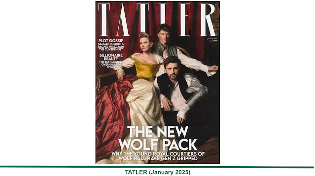
The masthead represents the name of your publication and is, arguably, the most crucial aspect of your magazine cover design. In the real media world, many hours of time will be spent perfecting the masthead for a new magazine.
This is where branding becomes important. The masthead is the name of the magazine and the most consistent element throughout the publication's issues, and it's how readers will recognize the magazine. It will also be used at the top of the website accompanying your magazine.
Take a look at the image below which shows part of a magazine display at a well known high street shop. Mastheads are traditionally at the top of the front cover due to how they are positioned behind each other on a shelf.
 |
| Which of these mastheads catches your eye the most? |
What Next?
Design your masthead and strapline.
In class, I will show you how to do this and how to use the website Dafont.com to search the different fonts available.
I will also show you how to download the fonts that you think are most appropriate for your masthead and strapline and add these to Adobe Photoshop.
You can then produce a mock-up of your masthead and strapline in different fonts to see which resonates best with your target audience.
Planning Task 6
Create a post for your blog titled:
Planning Task Three: Masthead Design
In this post show evidence of the process you go through to select the typographical elements for your masthead and strapline.
This should include multiple mock ups for your magazine which includes the name of the fonts used.
Make sure that you are clear in identifying which design you are ultimately going for and make sure you know the name of the font as you will need to import this into Photoshop and Wix at a later date.
DeadlineFriday 26th September


